I downloaded the May 2017 version of PowerBI desktop to load in some of the traffic data that I dropped into Qlik Sense and Tableau in a previous post.

The finished article first
So - back to getting started. This is my first time using the software, and it'a pleasant experience right up until I try to load an .xls file.
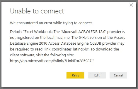
A missing driver? Already?
I have to admit, I'm a little surprised that the driver required to connect to a .xls file isn't included with the download. I would expect .xls to be one of the most common files loaded into the desktop version of PowerBI. It turns out the access database engine is used to connect to earlier versions of excel files, and another download is needed - but enough of that!
Loading the data
A nice interface and good progress updates are a welcome touch, so aside from the driver issue I loaded the 2012-03 dataset (~800MB CSV) quickly. Then, a simple drag and drop joins the lat/lon coordinates to my data.
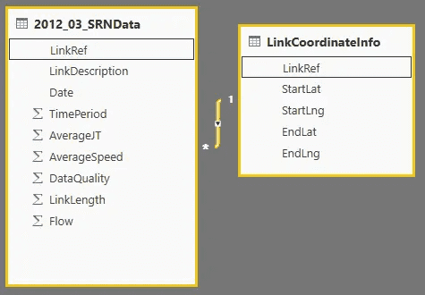
Loading the data is simple, only the AverageSpeed field was transformed
As per my Qlik and Tableau post, I convert the speed from kilometres to miles. There's a load of other changes I could make to trim long decimals and tidy up the dates but that's for another day.
Visualising in a map (bubbles)
To load into the map and have it look a little similar to my other examples was challenging, as PowerBI doesn't appear to provide as much flexibility out of the box for colour or bubble size. The bubble size is still gigantic even when set to 0%, and you need to set diverging gradients quite carefully to ensure the middle colour doesn't look out of place.
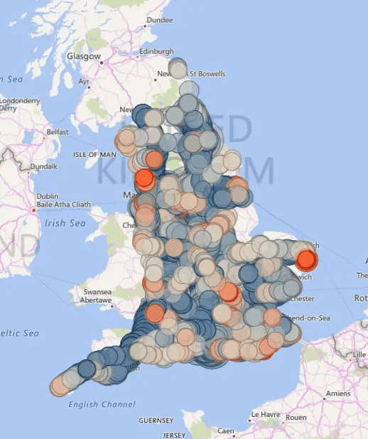
It's a busy map
A couple of nice additions popped out though, including the in-built binning feature. This is available in Qlik GeoAnalytics, but not in the core map product - I had a quick play and although it doesn't make sense to apply it on this dataset, it's a welcome feature. I'll need to check Tableau at a later point.
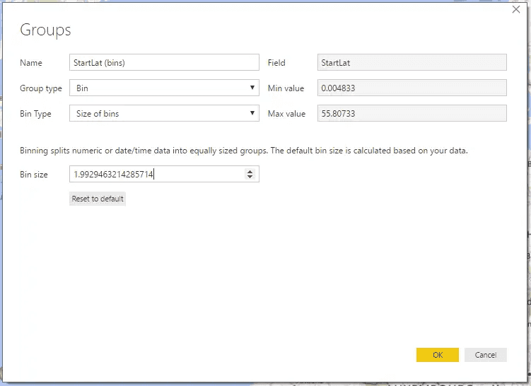
Binning is a welcome feature
The other element of interest is the "Quick Insights" feature. It pulled some insights that I agree with (even if they are common sense on this flat dataset). I'm keen to try it with something a bit more exciting and see what it turns out.

The Quick Insights feature provided some valid feedback
My favourite here is the top right - that average journey time correlates with the distance travelled (well, yeah). But, again, I'm keen to see this on a more interesting dataset.
And...the app
Another embedded app to play with. Like the Tableau embeds I'm pleased that this one also links to the full screen content!