Domo is a cloud visualisation tool that offers a wealth of connectors (400+ according to their website) and a simple learning curve.
I thought I'd have a go connecting to the same google analytics account as I did with Qlik Cloud a while ago. This will be using the Domo free tier, which you can use to share up to 50 cards at the time of writing.
Connecting to Google Analytics
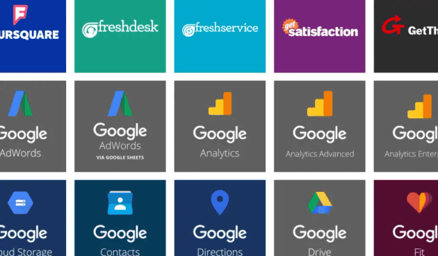
1 - Pick the connector you want from the connectors page (there's a lot of choice).
We're using the Google Analytics connector
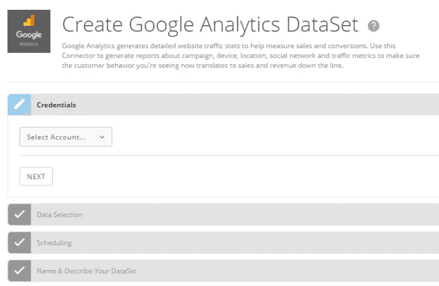
2 - You're presented with what looks like a four step process, so hit the dropdown and add a new account.
It's a four step process, starting with connecting to your Google Analytics account
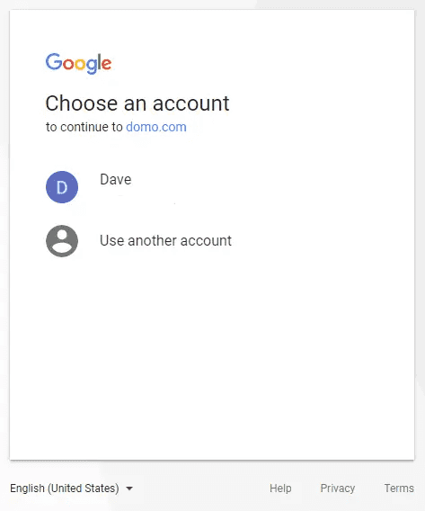
3 - We're greeted by the familiar Google account screen, where we approve the request as for any other app.
Say hello to the standard google prompt
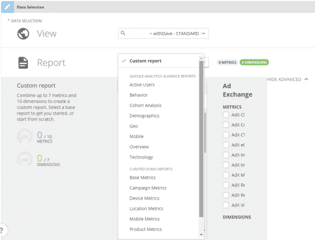
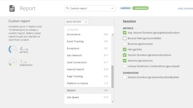
4 - Back at Domo, we can switch between the properties we want to view (in this case withDave), and the reports we want to build. As with the Qlik Sense connector, this selects the dimensions and metrics (measures) that we want to pull down.
Domo carries all the standard reports and more
By selecting either a custom or pre-made report, Domo builds the query. Note that the page clearly displays how many dimensions and metrics we are able to load in one query on the left of the page.
Domo clearly displays what selections you've made, and how many more dimensions and metrics you can add
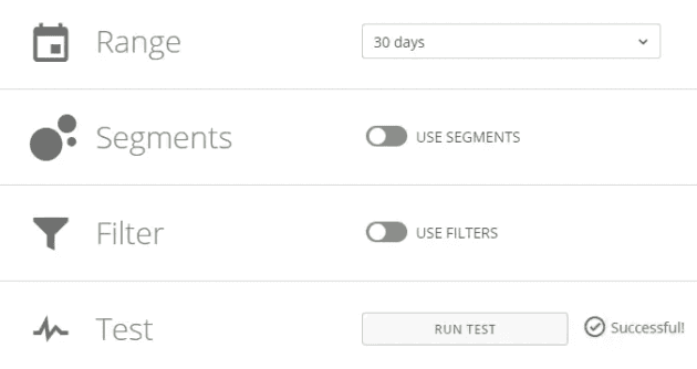
5 - Next up is defining the date range to load (date range, number of days, or days since last successfully run) and providing any segment and filter information. You can also test the configuration to check it's valid.
Domo offers flexible filters and segments
Setting the segments and filter criteria requires you to provide a JSON string containing the fields and values you wish to reduce the data with. This is as per the google documentation on how to build segment and filter requests.
JSON sample to return data where the ga:pageviews metric is greater than 2 (the example provided, although WordPress will ruin the formatting):
{
"metricFilterClauses":[
{
"filters":[
{
"metricName":"ga:pageviews",
"operator":"GREATER_THAN",
"comparisonValue":"2"
}
]
}
]
}
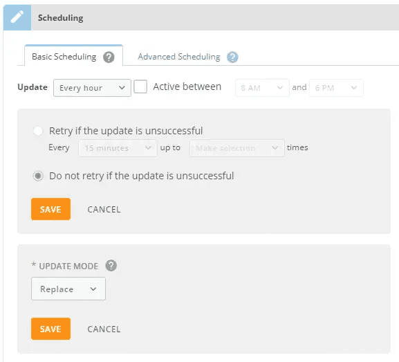
6 - Setting up refreshes of the data is simple, and flexible. You can refresh down to 15 minute intervals, specify when refreshes should happen (active hours) and also specify how many times a failed refresh should be retried (up to 10 times).
There is good flexibility in refresh scheduling, and the mode offers either append or replace
As the connector offers either append or replace, this realistically offers you two options:
-
If you're running a rolling x day report, then this isn't a problem
-
If you're trying to build up a history and don't want to pull all data daily, then set the data refresh range to "since last successful refresh" and the update mode to "append"
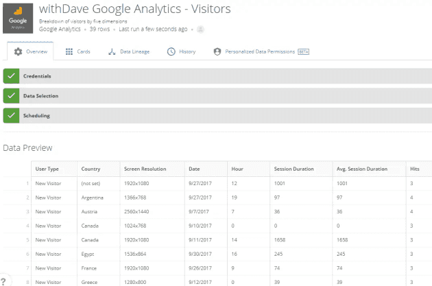
7 - After giving the data set a name, the tool return a summary and sample of the data. I've added filters for a browser, minimum session count and device.
Once you've added a name, you get a snapshot of the data
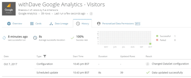
8 - You now have your dataset loaded and ready to go. From here you can build it into an ETL but we'll be using it on it's own in our cards so don't need to touch that for now.
You can look at the refresh history, data lineage, linked cards, permissions, or start configuring more advanced properties
There's some attractive visualisations that bring all your data sources onto one page. At the moment, ours is a little sparse.
It's in our (very empty) data warehouse!
I'll create a card (and on the Qlik Cloud side, an app to compare it to) to build off of this data in an upcoming post.

